Color is one of the most powerfuls tools that the interior designer needs to understand. Color not only makes a place attractive and interesting but affects human phycology and behavior.
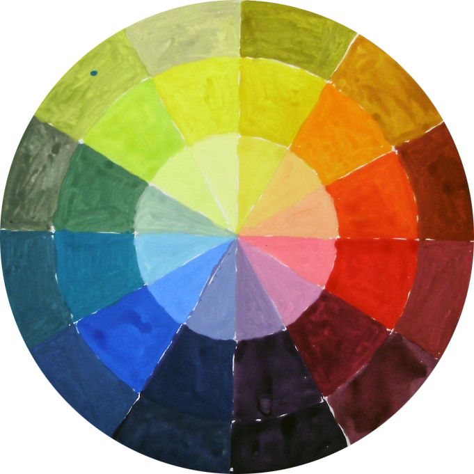
If you examine any color wheel, you'll see that the colors to the one side (yellows, reds and oranges) seem warm and the colors to the other (blue, violet, and green) seem colder.
In relation to home decoration warmer tones are considered:
- To move forward" & to come closer to the viewer.
- To make a room feel comfy, warm and inviting
Cooller tones are considered
- To make a room calm
- To make a room seem larger and brighter
Visual temperature is not a totally independent quality but it is rather affected by any adjacent color or colors.
Some tones of violet for example might seem cool while some others warm. If you place any violet next to a warm red then the violet seem cool. If you place the same hue next to a light blue then it will seem warm.
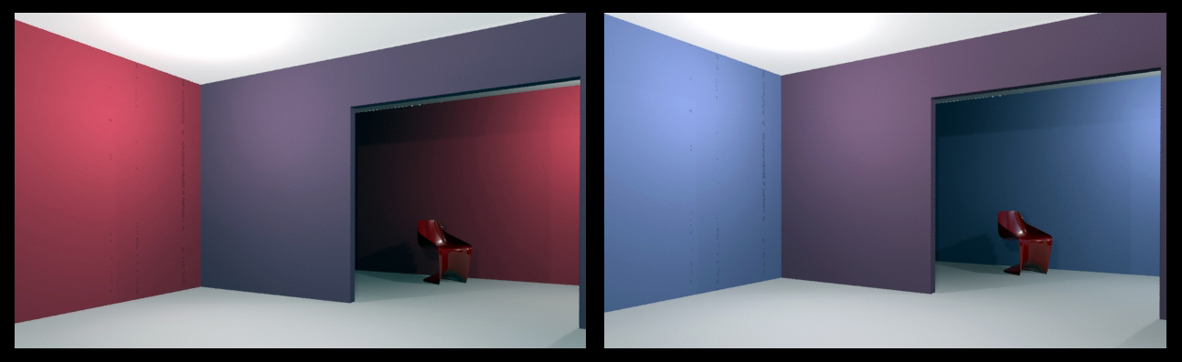
In the first image, the violet wall seem cooler. In the second the violet wall seem warmer.
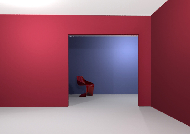
Inevitably, the juxtaposition of warm and cool colors intensifies each. If you paint for example a room red or orange and an adjoining room blue, then each space will seem more warm or cool. Similarly, in the same room cool walls will make a red sofa or a wooden floor seem warmer.
A warm paint room next to a cool paint room.


| < Prev | Next > |
|---|
Related articles
The most complete book about Furniture Arrangement

Latest advice